
Web Layout Best Practices: 3 Timeless UI Patterns Analyzed
UI design trends may come and go on the web, but several UI patterns have stood the test of time. What makes a UI pattern timeless? Adherence to web layout best practices that result in a combination of user-friendliness and adaptability to changing trends and technology.
There are a few criteria that make UI patterns endure. User-friendliness is one of them. A UI pattern that “looks amazing” but doesn’t facilitate great usability is not one that will last for long.
The most useful UI patterns are also adaptable to changing trends. Card-style and grid-based layouts, for example, can be implemented by UI designers in a variety of ways. Adaptability makes it possible for them to continue looking modern and on-trend, even though they may have been around for years. The same is true for the other UI patterns included here.
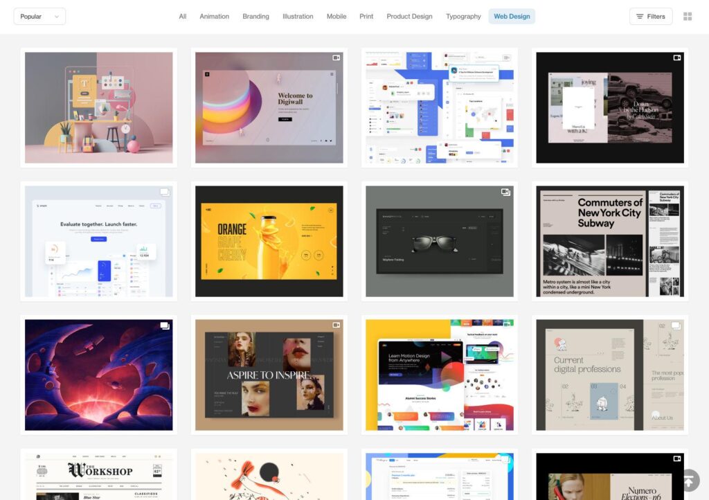
Card-style Web Layout Patterns
Card-style layouts were popularized by sites like Pinterest, Facebook, and Twitter. They have become standard on news sites and blogs, as they’re well suited to placing a lot of content on a page while keeping each piece distinct.
As the name suggests, these layouts use content blocks that resemble physical cards of various shapes and sizes. There are two primary layout formats. One layout arranges cards with equal dimensions on a grid (as seen on the Toptal design blog homepage), while the other uses a fluid layout with different size cards arranged into orderly columns but without distinct rows (like Pinterest’s layout).
Card-style layouts work well because they allow different content to be arranged in an orderly way while keeping all the pieces separate. Cards are also familiar to people because they recognize card-shaped items from the real world. They make sense psychologically and are easy for people to use even if they’re new to a website.
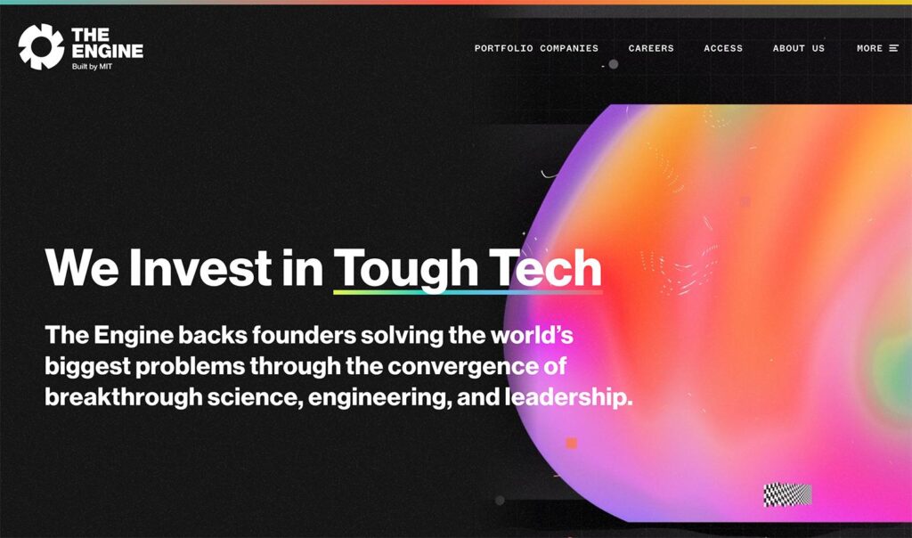
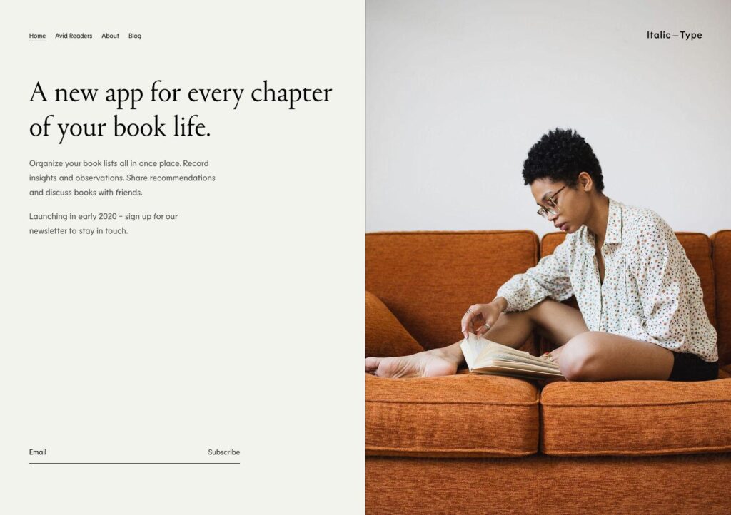
Split-screen Layouts
Technically, split-screen layouts date back to 1903, to the film Life of an American Firefighter by Edwin S. Porter. But in web UI design, split-screen layouts started gaining popularity in 2013 and really started picking up steam in 2016.
Split-screen layouts are a popular design choice when two elements need to have equal weight on a page and are often used in designs where text and an image both need to be featured prominently. Placing them side by side instead of vertically or with a text overlaying the image is a conscious design choice that can lend a sophisticated, minimalist quality. Two images placed side by side are also commonly seen, sometimes with text overlays.
Most split-screen designs are divided fairly evenly, though some are split at different ratios. (33:66 or 40:60 seem to be the most popular ratios; when a screen is divided into a smaller size than ⅓, it’s more like a sidebar than a true split-screen design.)
Split-screen designs are particularly well suited to product pages on eCommerce sites. Product images need to be prominent on these pages, but so does essential information like price, specifications, add-to-cart buttons, and product options.
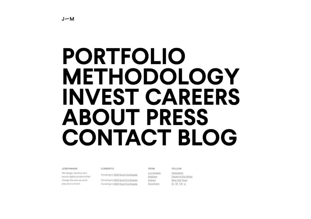
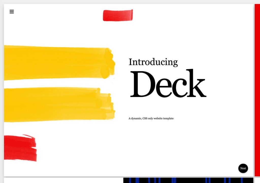
Big Typography
Big typography has been around since the advent of the web but gained popularity when mobile design became prevalent.
Large type is especially popular in headings and titles, but it’s also seen in the body copy on some sites. When the right font is chosen, larger text is more readable and improves the user experience. Plus, it makes a powerful visual statement. It’s particularly popular in minimalist design, where other visual elements are mostly absent.